Understanding the Psychology of Color in Photo Design

[ad_1]
Color is a powerful tool in the realm of photography, influencing not only the aesthetic appeal of an image but also the emotional and psychological responses it evokes in viewers. It plays an integral role in shaping perceptions, guiding feelings, and enhancing narratives in visual storytelling. Understanding the psychology of color in photo design can transform a simple photograph into a compelling visual statement, allowing photographers to better communicate their intended message.
The Basics of Color Theory
Before delving into the psychological implications of color, it is essential to understand foundational color theory. The color wheel, created by Isaac Newton, is a fundamental tool for artists and designers. It organizes colors around a circular format, allowing us to see relationships between hues. The wheel is divided into:
- Primary Colors: Red, blue, and yellow—colors that cannot be created by mixing other colors.
- Secondary Colors: Green, orange, and purple—created by mixing primary colors.
- Tertiary Colors: These are combinations of primary and secondary colors (e.g., red-orange, yellow-green).
Color theory also encompasses concepts like complementary colors (those opposite each other on the wheel), analogous colors (adjacent colors), and triadic colors (three colors evenly spaced on the wheel). Understanding these relationships helps photographers create harmonious and visually pleasing images.
The Emotional Impact of Color
Colors evoke specific emotions and reactions based on cultural contexts, personal experiences, and even biological responses. The following are some common associations tied to various colors:
Red
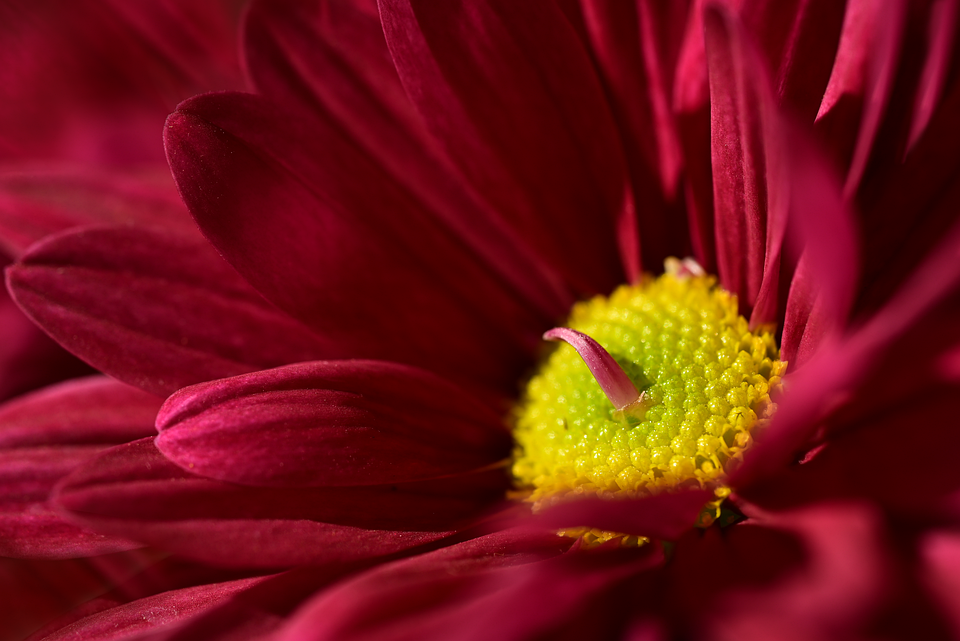
Red is often linked to strong emotions like love, passion, anger, and excitement. It can draw attention and provoke a sense of urgency. Photographs utilizing red can convey intense feelings and direct viewers’ focus, making it suitable for subjects like romance or high-energy events.
Blue
Blue generally evokes feelings of calm, trust, and sadness. It can create a sense of tranquility, often associated with nature (like the sky or ocean). Photographs featuring blue tones can communicate peace or depth, making them ideal for landscapes or introspective portraits.
Yellow
Bright and cheerful, yellow is often associated with happiness, optimism, and energy. It can also signify caution. In photography, yellow can bring a sense of warmth and positivity, effectively highlighting details or drawing attention to key elements in a frame.
Green
Symbolizing nature, growth, and renewal, green evokes feelings of health and tranquility. It can create a sense of balance and stability. Photographs that feature green often elicit a sense of peace and connection to the earth, making it ideal for landscapes, flora, and wellness-related themes.
Purple
Purple is historically associated with royalty, luxury, and creativity. It often evokes feelings of mystery and spirituality. In photography, purple can add depth and intrigue, whether through capturing flowers, fabrics, or abstract compositions.
Orange
Sometimes seen as a combination of red’s energy and yellow’s warmth, orange evokes enthusiasm, creativity, and a sense of adventure. In photography, it can serve as a vibrant accent color, sparking a lively and invigorating mood.
Black
Often associated with sophistication, elegance, and power, black can also signify mystery and mourning. In photographic design, black can create dramatic contrasts and emphasize negative space, making it a favorite in high-contrast compositions and portrait photography.
White
White symbolizes purity, simplicity, and innocence. It evokes feelings of peace and cleanliness. In photography, white can enhance minimalistic designs or highlight subjects effectively against darker backgrounds.
Cultural Considerations in Color Psychology
It’s crucial to remember that color meanings can vary widely across cultures. While western cultures often associate white with purity and weddings, many eastern cultures view it as a symbol of mourning and loss. Similarly, colors such as red and yellow have diverse meanings in different cultural contexts. For photographers, understanding these cultural symbolic meanings is vital when targeting specific audiences or conveying particular messages.
Utilizing Color for Composition
Color plays a significant role in composition, guiding the viewer’s eye and creating balance within a photograph. Here are a few ways photographers can utilize color in their compositions:
Contrast
Using contrasting colors can draw attention to particular elements within a photo. For instance, a bright yellow flower against a dark green background can make the flower stand out, creating a focal point.
Harmony
Analogous color schemes—those that use colors next to each other on the color wheel—can create harmony and cohesion in an image. This can be particularly useful in landscape photography, where various shades of blue and green can create serene and unified visuals.
Color Blocking
Color blocking involves using bold, solid colors in selected areas to create visual interest and emphasis. This technique is often seen in modern photographic styles and can be effectively utilized in fashion photography or promotional images.
Monochrome
A monochromatic color scheme is composed of variations in lightness and saturation of a single hue. This approach can create a striking visual impact, evoking a specific mood or atmosphere without distraction from multiple colors.
The Role of Lighting
Lighting significantly impacts how colors are perceived in photography. Natural light offers a different quality than artificial light sources, influencing color vibrancy. For instance, the golden hour—shortly after sunrise or before sunset—casts warm hues, enriching colors and creating a captivating atmosphere.
Photographers must also consider white balance. The wrong settings can lead to color casts that distort the actual hues present in the scene, resulting in photographs that fail to convey the intended emotional tone. Adjusting white balance in editing can help achieve accurate colors and evoke the desired emotional response.
The Influence of Color in Branding and Marketing Photography
Color not only affects psychological responses but also has immense implications in branding and marketing photography. Companies often use specific color palettes in their branding to evoke certain emotions and attract targeted audiences. For example, fast-food chains frequently use red and yellow, colors associated with appetite and attention. In contrast, tech companies might lean towards blue hues to convey trust and security.
When taking promotional photos, understanding the client’s brand and target audience is critical. The chosen colors should align with the message the brand wishes to communicate and the emotions it hopes to evoke in potential customers.
Enhancing Storytelling Through Color
Color can significantly enhance narrative storytelling within photography. Photographers can manipulate hues and color contrasts to emphasize themes or emotions:
Narrative Identification
Color can signal a change in mood or tone throughout a photo series. For instance, a sequence transitioning from sepia or muted tones to vibrant colors can signify a journey of growth or transformation.
Subject Emphasis
Colors can highlight specific subjects in a visual story, allowing viewers to connect emotionally. For example, a photograph of a person in a bright red dress amidst a dull background can immediately draw attention to that individual, making their narrative the focal point of the composition.
Establishing Atmosphere
Photographers can use colors to establish a particular atmosphere or setting, whether it’s the warmth of autumn foliage or the coolness of a winter landscape. This use of color provides contextual information and deepens the viewer’s understanding of the scene.
Practical Applications: Strategies for Photographers
Here are some practical strategies photographers can implement to leverage the psychology of color effectively:
Experiment and Explore
Take the time to experiment with different color combinations and lighting setups. Review the ways color changes the mood of your photographs and which palettes resonate with your intended audience.
Analyze Color Palettes
Study color theory and analyze existing photographs to understand how various colors interact. This analysis will inform your own compositions and help you make conscious choices regarding color.
Use Color Profiles
In digital photography, utilizing color profiles can help you maintain consistent colors throughout your edits. This feature allows you to ensure that the colors represented in your work are true to life, which is essential for any professional project.
Create Emotion Boards
When working on a specific project, consider creating an emotion board to explore different colors associated with various feelings. Use samples of colors that inspire you for your desired narrative, which can aid in guiding your color choices during shoots.
Educate Clients
If you’re working with clients, educate them about the importance of color in photography. Discuss how their chosen palette can influence their branding or the emotions they want to evoke through promotional imagery.
Conclusion
Understanding the psychology of color in photo design is an essential skill for photographers seeking to create impactful, memorable images. Through an in-depth knowledge of color theory, emotional associations, and cultural contexts, photographers can manipulate colors to craft compelling visual narratives. Additionally, considering practical applications—such as harmonizing compositions, utilizing lighting effectively, and adhering to branding techniques—can elevate a photographer’s work to new heights.
By harnessing the power of color thoughtfully, photographers can engage audiences emotionally, convey messages clearly, and enrich storytelling in their visual art. Ultimately, mastering the psychology of color can transform a simple snapshot into a profound expression of humanity, evoking reactions that resonate with viewers far beyond the frame.
[ad_2]


